Making of Mitr
A digital product that helps newcomers in Canada create a support network. It was created as a part of deliverables for UX Design Bootcamp at BrainStation.
Role & Responsibilities
UX Research, UI Design, Branding
Constraints
Location: Temporarily limited to newcomers to Canada
Time: 3 months
Limited Resources: Budget,
User testers
Others: Personal bias as a newcomer to Canada
Tools
Figma, Adobe Creative suite (Illustrator, Photoshop,
Premiere Pro)
For centuries, immigrants have played a significant role in shaping Canada's economic landscape starting from the earliest settlers. In fact, recent data from Immigration, Refugees and Citizenship Canada (IRCC) reveals that immigration contributes to around 75% of Canada's population growth. However, due to their unfamiliarity with Canadian laws, customs, and connections, immigrants often find themselves vulnerable to legal disputes among other problems.
Goal
To provide immigrants with the resources necessary to create a supportive community that will aid in their seamless assimilation into Canadian culture.
User interviews
During the research phase, I conducted interviews with individuals who recently arrived in Canada or had been here for up to five years. The purpose was to gain insights into their challenges, motivations, and behaviours. Through these interviews, a common theme emerged: newcomers often experience feelings of loneliness and encounter difficulties in securing their first employment. Additionally, they expressed a lack of guidance regarding vital survival strategies. For e.g. many interviewees mentioned that they did not know how important it was to build a credit history which led to them having to pay higher interest interest rates on loans.
How might we...
...
guide and support newcomers to Canada in order to facilitate a smooth integration into Canadian life?
User Persona & Experience Mapping
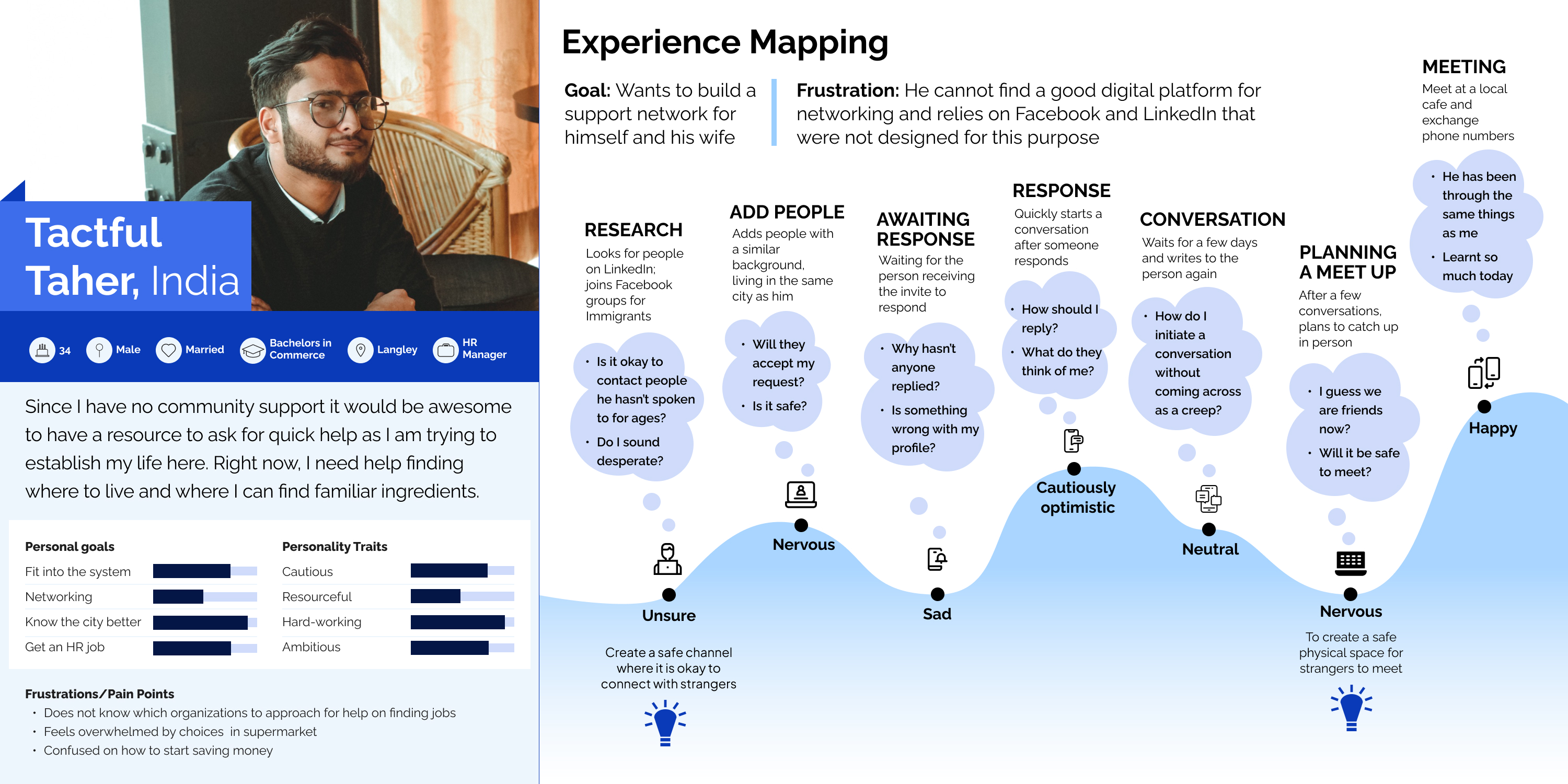
Based on the interviews conducted, I developed a User persona named Taher, who would benefit from the digital product solution. As a newcomer to Canada, Taher's efforts to connect with locals and understand Canadian society were mapped out on an experience map. Through this exercise, it was discovered that Taher was using social media platforms like LinkedIn to connect with strangers, which proved to be unsuccessful. Taher was often ignored by those he reached out to, or those who accepted his connection requests were unable to guide him due to time constraints. In order for Taher to achieve his goals, he needed to connect with the right people who could mentor him as an immigrant, much like a career mentor. This is precisely what my digital solution aimed to accomplish.
User Stories & Task Flow
Once I had a broad outline of what my application would offer, it was time to specify its tasks. User stories were created to identify these tasks. These stories asked, "As a newcomer to Canada, what do I want to accomplish and why?" For example, "As a newcomer to Canada, I want to [chat with locals in my community] so that [I can ask them which gas stations provide the cheapest gas]." These inputs were based on requirements discovered during interviews. Most user stories fall into two categories: one-on-one conversations with individuals and connecting with groups based on shared interests or needs. Click here to view the process or view all the user stories. These user stories were then used to create a task flow for the application.
UI inspiration board
To covert task flow into user-friendly screens, I analyzed popular social media apps and made sure the system matched the real world, following the usability heuristic. Through interviews, I found that immigrants found everyday tasks difficult due to the unfamiliar processes. For example, buying milk was challenging because the labels in Canada were different from those in their home countries. To prevent this feeling of unfamiliarity, I only studied globally popular apps. I learned that these apps prioritize functionality over grand designs.
Sketches to lo-fi application
Wanting to adhere to industry standards, I referenced Google’s Material 3 Design Kit while converting sketches to wireframes. As a student of UX design, I also wanted to familiarize myself with established guidelines.
Sketches and greyscale wireframes
Branding
I aimed for a word mark that represented a fun and authoritative brand. This is reflected in the choice of type font and colour. The app's primary colour blue, which represents professionalism is the brand colour, a different blue, derived from the mood board was used as a secondary colour. I created tints from the finalized colours and applied them to existing components while creating a hi-fi mockup.
Screenshots depicting how the branding of the website was done
Prototype
You can try the mock-up on the right or go to the Figma link.
Marketing
A website was created for marketing the app. A user would be able to download the app and learn more about its features on the website.
Samsung
galaxy watch
The application was also adapted to work with smartwatches.
Screenshot of how the application may look like on Samsung galaxy watch.

Next steps

Although, the prototype is ready, there is still room for growth and improvement in the application.

  • Icon depicting interactivity

    Add micro-interactions and features that make the app more usable to my target demographic.

  • Icon depicting people

    Create a task flow and prototypes for "Events" and "Consultation" sections of the app.

  • Icon depicting safety

    Address personal safety issues that the app may pose. Since, the app connects strangers it is important to ensure that the users of the App are authentic.