Establishing editorial design guidelines at The Ken
Founded in 2016, The Ken is a pan-Asian subscription-driven, digital publication headquartered out of Bangalore, India. As one of the earliest employees I was tasked with setting up the Editorial design function for the company
Role & Responsibilities
Art Direction, Data journalism
Constraints
Paywall: Consumers demand perfection as they pay a premium amount to consume content

Unknown brand: Hiring and retaining talented designers willing to risk working with a start up
Tools
Adobe Creative suite (Illustrator, Photoshop)
Overview
Before I joined the organization, the design assets that accompanied the news stories were either outsourced to freelance designers or were created by journalists themselves. There were not clear established guidelines that guided the creators of these assets resulting in inconsistent artwork with no visible visual identity.
Goal
To develop a brand identity for the visuals that accompany news stories published on the website.
Secondary Research
To begin with, I studied the company's website to understand its design language. I also looked at other digital news publications for inspiration. I learnt that visuals published at The Ken were primarily either data-centric, or they were visualizations of business models of the start-ups they covered. The purpose of the visuals was two-fold:
1. To simplify complex information
2. To provide visual breaks as the new stories were extremely long and detailed
Results
‍‍
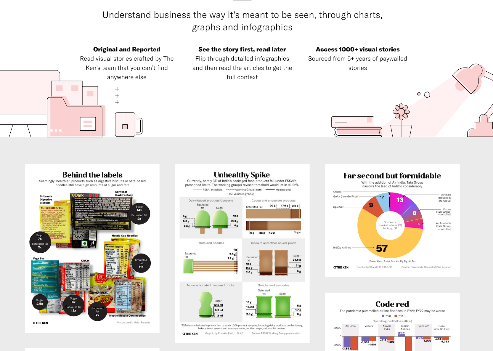
I created simple visualizations with a lot of white space, in order to provide breathing room to the story. I also used heavy illustrations in place of photographs that are dominant in traditional news publications. this created a unique identity for The Ken visualizations.

Visual Stories

For premium subscribers, an archive of infographics published on the website was made available as an additional feature.

View page